ENEnglish
 LTLietuviškai
 DEDeutsch
 FRFrançais
 RUРусский
 ESEspañol
 PLPolski
 ITItaliano
 UKУкраїнська
 CSČeština
 PTPortuguês
 JA日本語
 LVLatviešu valoda
 ETEesti
 HUMagyar
 IDBahasa Indonesia
 TRTürkçe
 HIहिन्दी
 ELΕλληνικά
 ARالعربية
 THไทย
 VITiếng Việt
 RORomână
 MSBahasa Melayu
 BNবাংলা
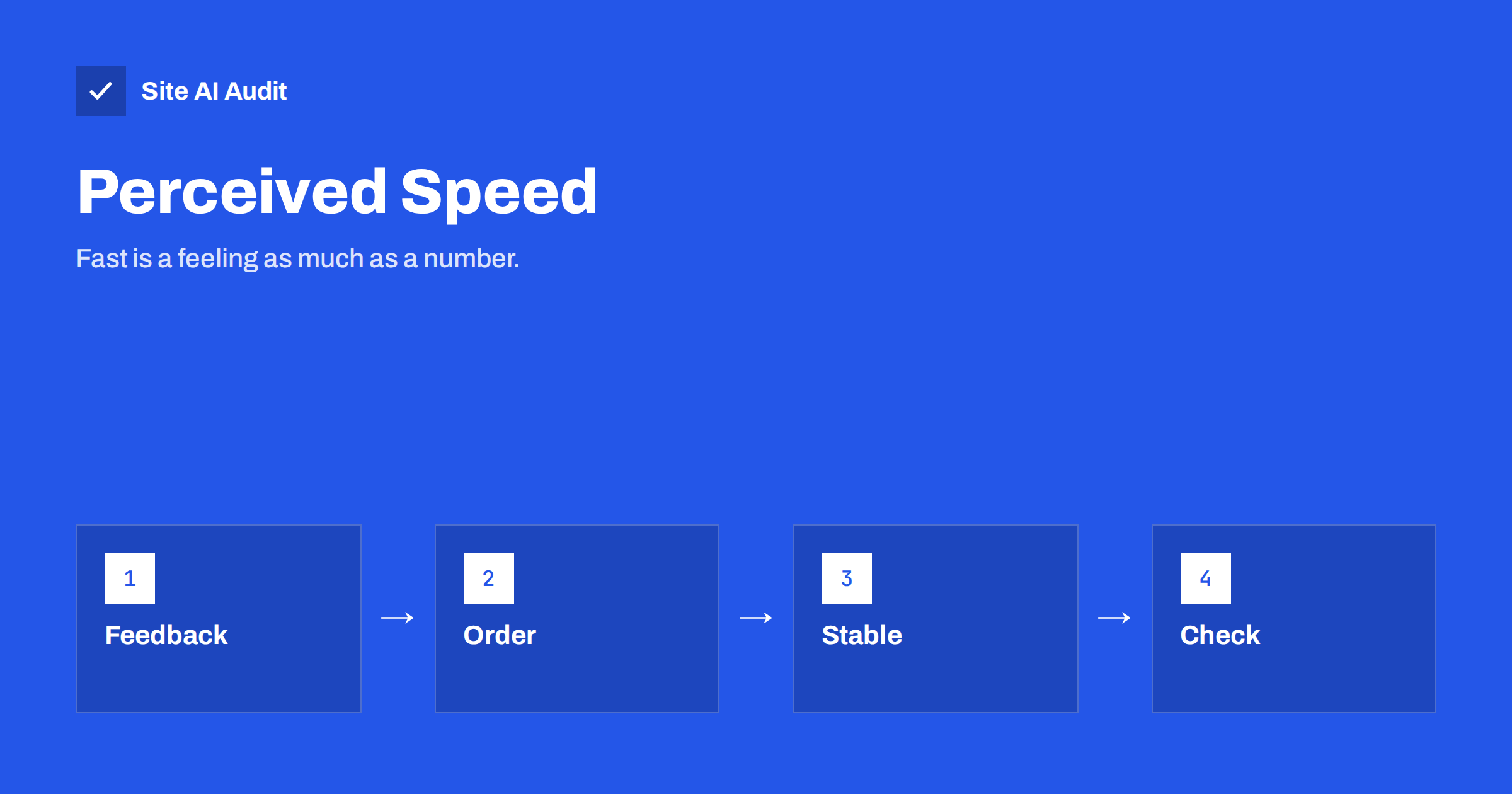
Short answer: Perceived speed is how fast a page feels to the person using it, and it does not always match how fast it measures. You can improve it without touching the server by answering every click at once, showing the most important content first, reserving space so nothing jumps, and giving clear signs of progress when something takes time. These changes help real visitors and they also support the metrics that Google measures.
Why feeling fast matters
A stopwatch tells you when a file arrived. A visitor does not care about files. They care about whether they can read, tap and decide. Two pages with exactly the same load time can feel very different. One shows a blank screen for three seconds and then everything at once. The other shows the heading and the main image after one second and fills in the rest. Most people say the second one is faster, even though both finish at the same moment.
Usability research has described this for decades. A response within about a tenth of a second feels instant. Around one second, the visitor notices a delay but keeps their train of thought. After about ten seconds, attention is gone. These are guidelines and not exact laws, but they give a useful target: make the first reaction immediate, and make the first useful content appear quickly.
How perceived speed differs from measured speed
Technical tools measure events such as the time to the first byte, the time to the largest element and the time to the first interaction. They are the foundation of the guide to Core Web Vitals, and you should keep improving them. Perceived speed adds the human side: what the visitor sees during the wait, how steady the page is and how quickly the page answers a touch.
Good news for site owners is that the two goals overlap. Showing the main content early improves the largest contentful paint. A stable layout reduces layout shift. Quick responses to taps improve the interaction metric described in the article on interaction to next paint. Work on feeling and work on numbers usually pull in the same direction.
Respond to every action at once
The most noticeable delay is the one after a click. A visitor taps a button and nothing happens for a moment, so they tap again. Fix this first.
- Show a pressed state. Buttons should change colour or shape the instant they are tapped, before any network request starts.
- Disable the button after the first tap in forms and checkouts, and show a short message such as “Sending”. This also prevents double submissions.
- Update the interface first where the action is very likely to succeed, for example by adding an item to a list at once and then confirming with the server. If the request fails, undo the change and say so clearly.
- Avoid long work on the main thread. Heavy scripts block the page from reacting, a problem covered in the article on long tasks and main thread work.
Show the important content first
Decide what a visitor needs in the first second. On a product page it is the name, the main photo and the price. On an article it is the title and the first paragraph. Send these first and delay everything else.
- Keep the top of the page light. Avoid placing sliders, videos or large scripts above the content people came for.
- Load the main image with priority and do not lazy load it, so that it appears early. The attribute described in the guide to fetchpriority helps here.
- Lazy load images below the fold, as explained in the lazy loading guide, so that they do not compete with the first view.
- Inline the small amount of style needed for the first view and load the rest later. The approach is described in the article on critical CSS.
- Defer scripts that are not needed yet. Chat widgets, pixels and extras can wait until the page is usable.
Reserve space so nothing jumps
A page that moves while it loads feels slow and unreliable, even if it is quick. The text shifts when an image appears, a banner pushes the content down, and a visitor taps the wrong link. The fix is to reserve space before the content arrives.
- Give every image and video a width and a height, or an aspect ratio, so the browser can leave room for them.
- Set a fixed height for ad slots, cookie notices and embedded widgets, instead of letting them push the page.
- Load web fonts in a way that does not cause large changes in text size. The guide to web font performance shows how.
- Insert new content below the part the visitor is looking at, not above it.
The metric behind this is explained in how to fix cumulative layout shift. A calm page feels faster because the eye can settle on the content at once.
Use placeholders and progress carefully
When a wait cannot be avoided, a good placeholder makes it feel shorter. A grey outline of the final layout, often called a skeleton, tells the visitor that content is on its way and where it will appear. A blurred low-resolution preview of an image does the same for pictures. A progress bar helps with uploads and long tasks, because people accept a wait better when they can see it moving.
Use these tools with restraint. A spinner that runs for a long time without any change is worse than no spinner. A skeleton that appears for a tenth of a second and flashes away is distracting, so show it only when a delay is likely. Never use an animation to hide a problem that should be fixed at its source, and respect visitors who have asked their device to reduce motion.
Make navigation feel instant
A visitor judges speed on every page, not only the first. You can speed up the feeling of moving through the site in several ways. Preload the next likely page, using the techniques in the guides to preload, preconnect and prefetch and to speculation rules, but only where the guess is right. Make sure that the back button restores the previous page at once, which the browser can do when you follow the advice on the back and forward cache. Keep menus and headers identical between pages so that the visitor does not feel a restart.
How to check how it feels
Do not rely on a single score. Open your site on a mid-range phone with a normal mobile connection, and watch a real visit from the first tap. Ask three questions. When does the first useful content appear? Does anything move after that? How long does it take for the first tap to get an answer? A screen recording from the browser developer tools shows these moments frame by frame, and the guide to reading a waterfall chart explains how to connect what you see with the files that were loading. Compare the result before and after each change.
Repeat the test after every significant change, and keep notes. Perceived speed is easy to lose without noticing. A new chat widget, a larger hero image or an extra font can each add a small delay, and together they change how the whole site feels. A simple routine helps: record the first visit on a phone, write down when the first useful content appeared and when the first tap was answered, and compare the numbers with the last test. If the page feels slower than the last version, undo the latest change first and look for the cause afterwards.
Ask a colleague or a friend who does not know the site to complete a simple task, such as finding the opening hours or adding a product to the basket, while you watch. Their hesitation shows delays that you have stopped noticing, because you know where everything is.
How Site AI Audit helps
Site AI Audit cannot judge how a page feels to a person, but it measures the numbers that sit behind that feeling. The report includes the Google PageSpeed score, Core Web Vitals, server response time, compression and page weight, so you can see whether a change helped. The free check covers up to 50 pages and needs no sign-up. You can run a free check of your website and see the plans for weekly monitoring that shows when a page becomes slower.
Related reading
- Core Web Vitals Explained for Small Business Websites
- How to Fix Cumulative Layout Shift (CLS) on Your Website
- How to Improve Largest Contentful Paint (LCP) on Any Website
- Why Your Website Is Slow on Mobile and How to Fix It
The bottom line
Speed is a number, but it is also an experience. Answer every tap at once, show the content that matters first, keep the layout still and use placeholders with care. These changes cost little, they help visitors who are on slow connections, and they support the measured scores. Test on a real phone and judge the page the way a visitor does.
KKK
What is perceived performance?
It is how fast a page feels to a visitor. It depends on what appears first, how steady the page is and how quickly it answers a tap, and not only on the total load time.
Do skeleton screens make a site faster?
They do not reduce the real load time, but they make waiting feel shorter because the visitor sees where content will appear. Use them only where a delay is likely.
Does perceived speed affect SEO?
Indirectly. The changes that improve how a page feels, such as showing the main content early and avoiding shifts, also improve the Core Web Vitals that Google measures.
Should I add a loading spinner to every page?
No. A spinner is useful for actions that take time, such as uploads. For normal page loads it is better to show real content early than to cover the wait with an animation.
What is the quickest improvement to try first?
Give buttons an instant pressed state and reserve space for images and embeds. Both are small changes with a clear effect on how the page feels.