ENEnglish
 LTLietuviškai
 DEDeutsch
 FRFrançais
 RUРусский
 ESEspañol
 PLPolski
 ITItaliano
 UKУкраїнська
 CSČeština
 PTPortuguês
 JA日本語
JA日本語 LVLatviešu valoda
 ETEesti
 HUMagyar
 IDBahasa Indonesia
 TRTürkçe
 HIहिन्दी
 ELΕλληνικά
 ARالعربية
 THไทย
THไทย VITiếng Việt
 RORomână
 MSBahasa Melayu
 BNবাংলা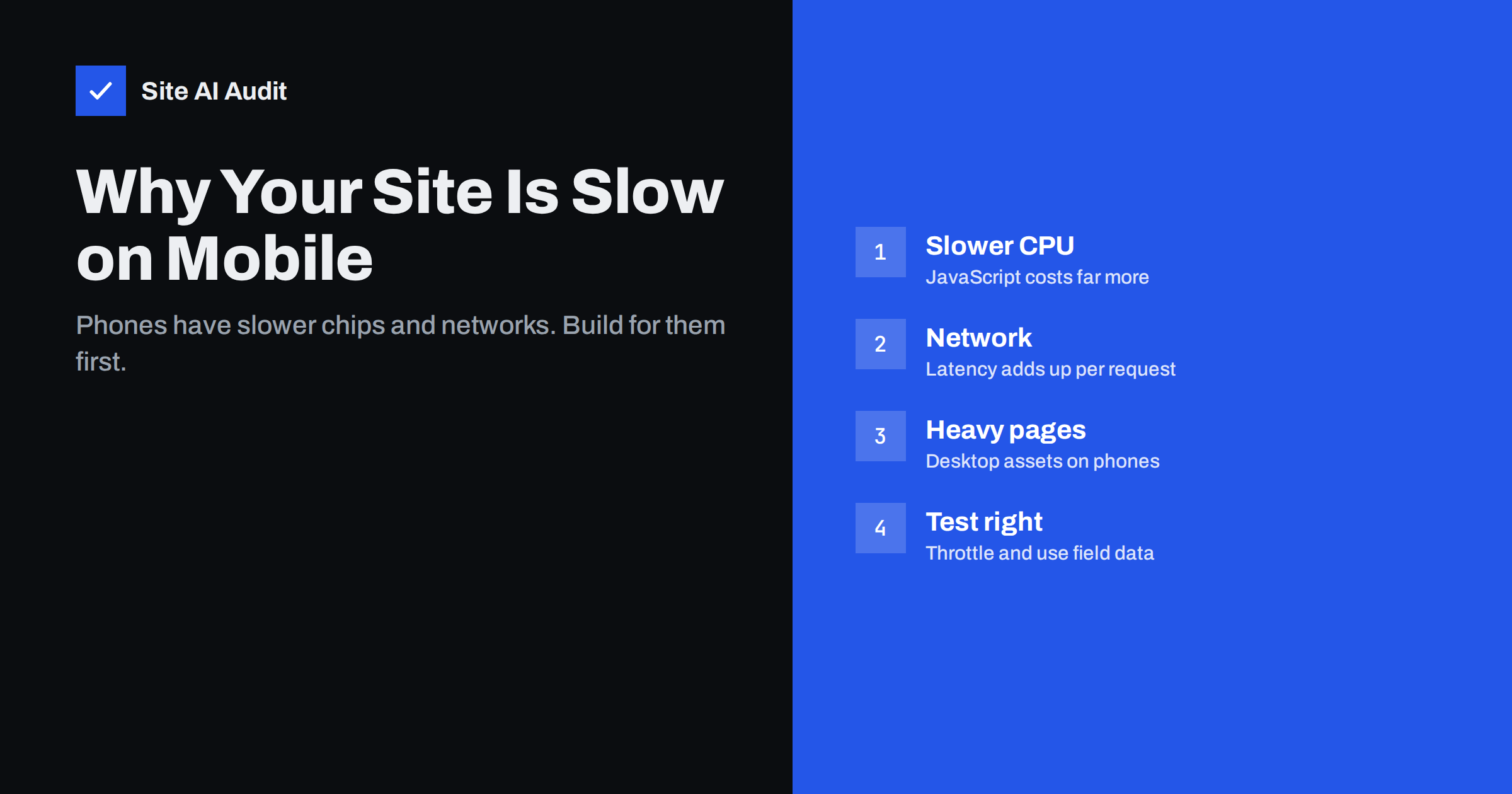
Short answer: Websites are slower on mobile because phones have much less processing power than laptops, mobile networks have higher latency and less stable bandwidth, and many sites send desktop-sized images and the same heavy JavaScript to every device. To fix it, test with a throttled mobile profile and real-user data, serve smaller responsive images, cut and delay JavaScript, reduce the number of requests and connections, and make sure your server responds quickly.
Business owners often judge their website on the device they work on: a recent laptop on a fast office connection. The site feels instant. Then a speed test shows a poor mobile score, or a customer mentions that the site “takes forever” on their phone. Both can be true at the same time. Mobile performance is a different problem from desktop performance, and it is the one that matters most, because for most small-business websites the majority of visitors arrive on a phone.
Why phones are slower than your laptop
Processing power. A popular mid-range or older phone has a processor several times slower than a modern laptop for the kind of work websites require. Parsing and executing JavaScript, calculating layout and decoding large images all take proportionally longer. A script that runs in 100 milliseconds on your computer can take much longer on the phone in your customer’s hand. Phones also slow down their processors when hot or low on battery.
Network latency. Mobile networks add delay to every round trip between the phone and the server, and that delay varies with signal strength, location and how busy the cell is. Each new connection, each redirect and each request that must wait for a previous one multiplies that delay. Bandwidth can be high on a good 4G or 5G connection, but latency often dominates for web pages made of many small requests.
Memory. Phones have less memory available for a browser tab. Very large pages, huge images and heavy scripts can cause the browser to struggle or reload the tab.
Why the same site behaves differently on mobile
- Desktop images on small screens. Without responsive images, a phone downloads the same 2,000-pixel hero as a large monitor.
- Hidden content still loads. Elements hidden on mobile with CSS are usually still downloaded, including images and scripts for sliders or desktop-only widgets.
- Different LCP element. On mobile, a different element may be the largest in the viewport, so desktop optimisations of the hero image may not help.
- Touch interactions. Mobile menus, filters and accordions depend on JavaScript responding quickly, which is exactly where slow processors hurt.
- Pop-ups and banners. Cookie notices, app banners and newsletter pop-ups take more of a small screen and can cause layout shift.
How to test mobile speed realistically
- Use real-user data first. PageSpeed Insights shows field data for mobile separately from desktop. The Core Web Vitals report in Google Search Console also splits mobile and desktop.
- Use the mobile lab test. PageSpeed Insights and Lighthouse simulate a mid-range phone with throttled network and CPU. Treat its results as a realistic, not a worst, case.
- Throttle in DevTools. In Chrome DevTools, enable device mode, choose a network profile such as “Fast 4G” or “Slow 4G”, and set CPU throttling to 4x or more. Then use the site: open the menu, scroll, fill a form.
- Test on a real, ordinary phone. Not the newest flagship. A two- or three-year-old mid-range Android phone on mobile data is a good reality check.
- Test several page types. Home, a landing page, a blog post, a product page and the checkout often behave differently.
Fix 1: Serve images sized for phones
- Use
srcsetandsizesso phones get appropriately smaller files. - Convert photos to WebP or AVIF.
- Do not lazy-load the main image; do lazy-load everything below the fold.
- Avoid loading desktop-only images and hiding them with CSS; use the
<picture>element for different crops instead. - Replace hero sliders with a single strong image; sliders load several large images and extra JavaScript.
Fix 2: Reduce JavaScript
JavaScript is the main reason mobile pages feel sluggish after they appear. Every kilobyte costs processing time on a slow chip.
- Remove unused plugins, tags and widgets.
- Load scripts only on pages that use them.
- Defer scripts that are not needed for the first paint.
- Delay chat widgets and similar tools until after the page is usable.
- Test the mobile menu and filters on a throttled CPU; they are the interactions visitors notice most.
Fix 3: Cut requests and connections
- Remove redirect chains, especially from ads and social links to the final page.
- Reduce the number of third-party domains; each one needs a new connection.
- Self-host fonts and limit them to a few files.
- Make sure your server supports HTTP/2 or HTTP/3, which handle many requests over one connection efficiently.
- Use a CDN if your visitors are far from your server.
Fix 4: Make the server fast
A slow server response hurts more on mobile because it adds to already higher latency. Enable page caching, keep PHP and the platform up to date, and check that Time to First Byte is consistently low, not just on a good day.
Fix 5: Keep the layout stable
- Set width and height on images and embeds.
- Show cookie banners as overlays rather than inserting them above content.
- Avoid interstitial pop-ups that cover the content right after a visitor arrives from search; they are frustrating on small screens.
- Reserve space for ads and dynamic widgets.
Desktop vs mobile: what typically differs
| Factor | Desktop | Mobile |
|---|---|---|
| Processor | Fast | Often several times slower |
| Network | Stable, low latency | Variable, higher latency |
| Screen | Large, needs bigger images | Small, needs smaller images |
| Main risk | Heavy images | JavaScript execution and latency |
| Typical PageSpeed lab score | Higher | Lower for the same site |
Mobile speed on shops and booking sites
Online shops and booking sites deserve extra attention on mobile, because the steps that earn money are also the heaviest. Product pages carry galleries, variation selectors, reviews, recommendation widgets and several marketing tags. Category pages load dozens of thumbnails and filters. Checkout pages add payment scripts, address lookups and fraud checks. On a phone, each of these adds processing time exactly when the visitor is deciding whether to buy.
Walk through the full purchase on a throttled mobile profile at least once a quarter: search or browse, open a product, choose a variant, add to cart, and go to the payment step. Note every moment where you wait or where a tap does not respond immediately. Those moments are your priority list. Ask a colleague to do the same on their own phone, because devices and networks differ more than most teams expect. Typical fixes are lazy-loading gallery images beyond the first, loading reviews when they scroll into view, limiting recommendation widgets, and keeping marketing tags off the checkout unless they are strictly needed there.
Priorities for a small business site
If you can only do a few things this month, do these in order: make sure the server responds quickly with page caching; compress and resize the main image and serve it as WebP; remove or delay the heaviest third-party scripts; set image dimensions. On most small-business sites, these four steps produce the largest visible improvement for mobile visitors, well before more advanced techniques like critical CSS or code splitting are worth the effort.
How Site AI Audit helps
Site AI Audit measures your site the way Google does for phones: every check runs Google PageSpeed in mobile mode and reports LCP, CLS and INP, server response time, compression and page weight. Findings are explained in plain words and ranked by impact, so you know which mobile problem to tackle first. Check your site for free in one to two minutes.
Related reading
- Core Web Vitals Explained for Small Business Websites
- Image Optimization for Faster Websites: A Practical Guide
- How to Reduce Unused JavaScript and Speed Up Your Pages
- How Third-Party Scripts Slow Down Your Website (and Fixes)
The bottom line
Mobile visitors use slower processors on slower, less predictable networks, so the same page costs them much more. Test with throttling and real-user data, serve smaller images, cut JavaScript, reduce connections and redirects, keep the server fast and the layout stable. Fix mobile first, and desktop will almost always follow.
FAQ
Why is my PageSpeed score lower on mobile than desktop?
The mobile test simulates a mid-range phone with a slower processor and a throttled network. The same page takes longer to download and much longer to process. A large gap between mobile and desktop scores is normal and points to JavaScript and page weight.
Does Google rank my site based on mobile speed?
Google uses mobile-first indexing, so it primarily uses the mobile version of your content. Core Web Vitals are one of many page experience signals and are assessed separately for mobile and desktop. Content relevance matters much more than speed for rankings.
How can I test my site on a slow phone without buying one?
Chrome DevTools can emulate a mobile screen and throttle both network and CPU. Set CPU throttling to 4x or 6x and a mobile network profile, then use the site normally. PageSpeed Insights also runs a simulated mobile test.
Do hidden elements on mobile still slow the page?
Usually yes. Content hidden with CSS is still in the HTML, and its images and scripts are often still downloaded. Use responsive images and avoid loading desktop-only features on mobile at all.
Is AMP needed for mobile speed?
No. AMP is no longer required for any special placement in Google Search, and a well-built responsive site can be just as fast. Focus on the fixes that improve your existing pages.