ENEnglish
 LTLietuviškai
 DEDeutsch
 FRFrançais
 RUРусский
 ESEspañol
 PLPolski
 ITItaliano
 UKУкраїнська
 CSČeština
 PTPortuguês
 JA日本語
JA日本語 LVLatviešu valoda
 ETEesti
 HUMagyar
 IDBahasa Indonesia
 TRTürkçe
 HIहिन्दी
 ELΕλληνικά
 ARالعربية
 THไทย
THไทย VITiếng Việt
 RORomână
 MSBahasa Melayu
 BNবাংলা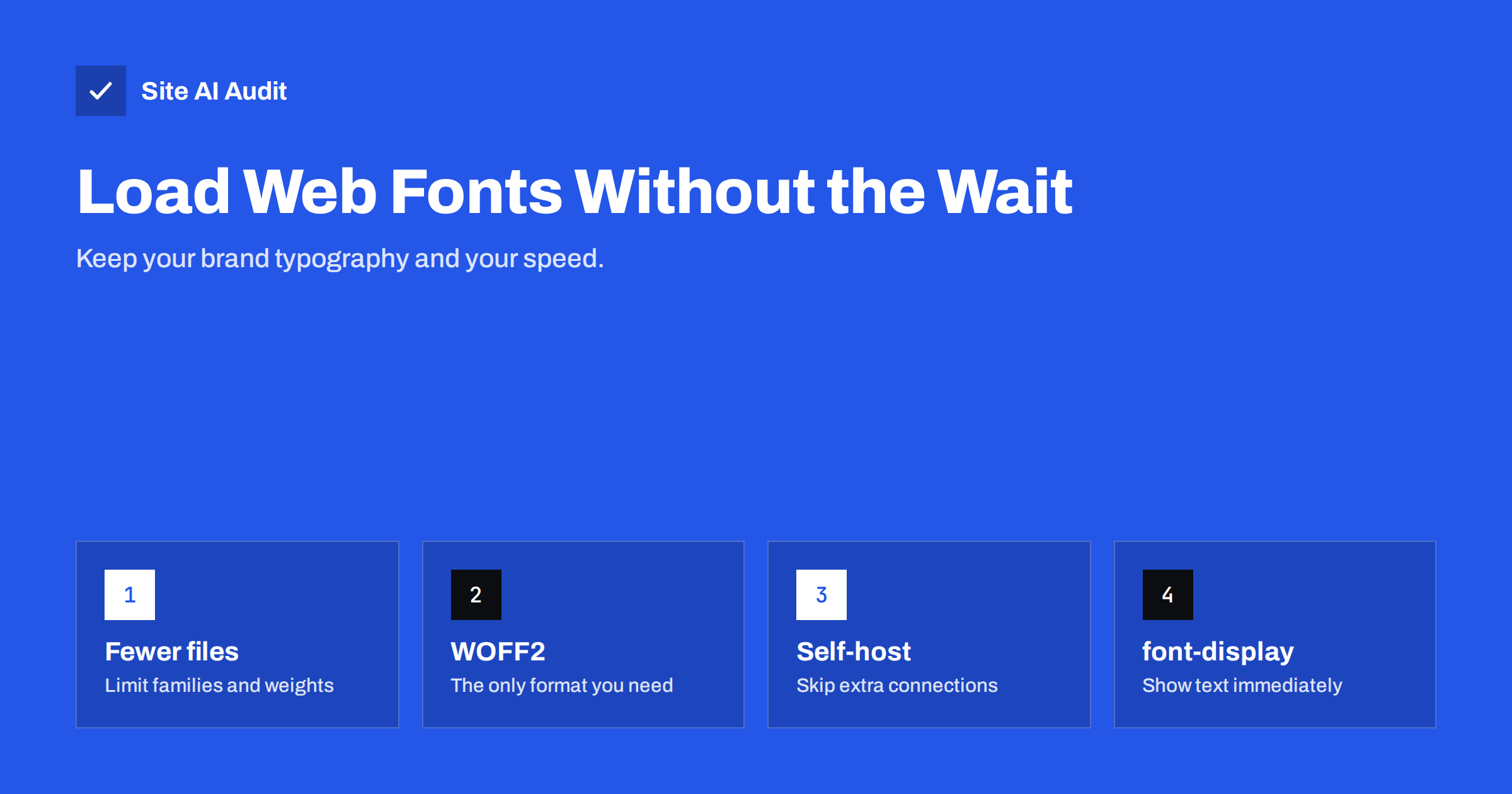
Short answer: To load web fonts without slowing your site, use as few font families and weights as possible, serve them in WOFF2 format, host them on your own domain where the licence allows, subset them to the characters you need, preload the one or two files used above the fold, and set font-display: swap or optional so text appears immediately in a fallback font. Matching the fallback font’s size reduces layout shift when the web font arrives.
Typography is part of a brand, and web fonts are how brands get consistent typography on every device. But fonts are also one of the sneakiest performance problems. They are discovered late, because the browser only learns which font files it needs after downloading and processing the CSS. They can hide text until they arrive. And when they do arrive, the text can change size and push the layout around. The good news is that each of these problems has a well-established fix.
How font loading affects speed and Core Web Vitals
- Invisible text. Some browsers hide text using a web font for up to about three seconds while the font downloads. This is called a flash of invisible text (FOIT). Visitors see a page without words.
- Delayed LCP. If the largest element on the page is a heading or paragraph, and its text is hidden until the font loads, Largest Contentful Paint waits for the font.
- Layout shift. When the web font replaces the fallback, differences in letter width and line height make text reflow. That contributes to Cumulative Layout Shift.
- Extra connections. Fonts from an external provider require connections to one or two more domains, each with DNS, TCP and TLS setup.
- Bytes. Each weight and style is a separate file. Regular, italic, bold, bold italic, light and black in two families quickly become a dozen downloads.
Step 1: Use fewer fonts, weights and styles
The most effective font optimisation is using fewer files. Look at what your design actually uses:
- One family for headings and one for body text is plenty for most sites. Many look excellent with a single family.
- Two or three weights (for example regular, semi-bold and bold) usually cover every need.
- Italics are often used rarely; consider letting the browser synthesise them or dropping them for headings.
- Remove fonts loaded by plugins or old theme settings that are no longer used on the page.
- Consider a variable font: one file that contains a range of weights. If you use three or more weights, a variable font is often smaller than separate files.
- Consider a system font stack for body text. The fonts already installed on visitors’ devices load instantly and look native.
Step 2: Use WOFF2
WOFF2 is the modern compressed format for web fonts, supported by all current browsers, and it is significantly smaller than older formats. Older formats like EOT, TTF and SVG fonts were only needed for browsers that are long obsolete. If your CSS lists several formats, the browser downloads only one, but cleaning up old declarations keeps the CSS simpler. Do not apply Gzip or Brotli to WOFF2 files; they are already compressed.
Step 3: Self-host your fonts
Loading fonts from a third-party font service means the browser must connect to that service’s domains before downloading. Since browsers partition their caches by site for privacy, the old argument that a shared font CDN would already be cached from other sites no longer applies.
Self-hosting fonts on your own domain, where the licence allows it:
- removes extra DNS, connection and TLS time;
- lets you control caching headers and preloading;
- avoids sending visitor IP addresses to a third party, which also simplifies privacy compliance in some jurisdictions.
Many open-source fonts, including most popular fonts from large free font libraries, are licensed for self-hosting. Commercial fonts have their own licence terms; check them.
Step 4: Subset fonts
A font file often contains glyphs for many languages and symbols you never use. Subsetting creates a smaller file with only the characters you need, for example Latin and Latin Extended for most European languages. The CSS unicode-range descriptor lets you split a font into subsets and have the browser download only the subsets a page actually needs. Be careful not to remove characters you do use: names, currency symbols, and accented letters in other languages your site may publish.
Step 5: Control how text is displayed with font-display
| Value | Behaviour | Good for |
|---|---|---|
auto / block | Text may be invisible for a short period while the font loads | Icon fonts, rarely body text |
swap | Fallback text shows immediately, swapped when the font loads | Headings and brand text where the web font must appear |
fallback | Very short invisible period, short swap window, then keeps fallback | Body text, compromise |
optional | Uses the web font only if it is available almost immediately | Body text when speed and stability matter most |
With swap, text is readable right away, but a late swap can cause layout shift. With optional, first-time visitors on slow connections may see the fallback font, but the page never shifts; returning visitors will have the font cached. Many sites use swap for headings and optional for body text.
Step 6: Preload the critical font files
Because fonts are discovered only after CSS is processed, preloading the most important file helps it arrive in time:
<link rel="preload" href="/fonts/brand-regular.woff2" as="font" type="font/woff2" crossorigin>
- Preload only the one or two files used in the visible top of the page, such as the heading and body regular weights.
- The
crossoriginattribute is required for fonts, even on your own domain; without it the file is downloaded twice. - Preloading too many fonts competes with the main image and stylesheets and can make LCP worse.
- If you must use an external font provider, add
preconnectto its domains instead.
Step 7: Reduce layout shift from font swaps
Fallback fonts and web fonts rarely have identical proportions. CSS gives you tools to make the fallback match more closely:
size-adjustscales the fallback font so its average character width matches the web font.ascent-override,descent-overrideandline-gap-overridealign vertical metrics, so line heights stay the same.- Define these in a separate
@font-facerule for a local fallback font such as Arial, and list it right after the web font in yourfont-family.
Some frameworks and font tools generate these adjusted fallback declarations automatically. The result is that the swap is barely noticeable and adds almost nothing to CLS.
What about icon fonts?
Icon fonts were popular for years, but they load a whole font file for a handful of icons, render invisibly or as placeholder squares until loaded, and are harder to make accessible. Inline SVG icons or an SVG sprite are lighter, sharper and more reliable. If your theme loads a large icon font for a few symbols in the menu and footer, replacing it can remove a sizeable request from every page.
A quick font audit you can do today
- Open DevTools, Network panel, filter by “Font” and reload the page.
- Count the files and note their size, format and domain.
- Check the CSS for
font-displayin each@font-facerule. - Compare the files with what the design uses; remove unused weights and families.
- Run PageSpeed Insights and look for font-related warnings, layout shift culprits and the LCP element.
How Site AI Audit helps
Site AI Audit runs Google PageSpeed for mobile during every check and reports LCP, CLS and INP alongside page weight and server response time. Slow font loading shows up through its effect on those metrics, with a plain-language explanation of the fix, ranked against your other speed, SEO, security and e-mail findings. Run a free check to see whether fonts are holding your pages back.
Related reading
- How to Fix Cumulative Layout Shift (CLS) on Your Website
- How to Eliminate Render-Blocking Resources on Your Website
- How to Improve Largest Contentful Paint (LCP) on Any Website
The bottom line
Web fonts do not have to cost speed. Use fewer families and weights, serve WOFF2 from your own domain, subset where you can, preload only what appears at the top, and choose a font-display strategy that shows text immediately. Adjust the fallback font’s metrics so the swap does not shift the layout, and replace icon fonts with SVG.
SSS
Do web fonts slow down a website?
They can, because they add downloads, may require extra connections and can hide text until loaded. With a few files, WOFF2 format, self-hosting and a sensible font-display setting, the impact becomes small. The problem usually comes from too many families and weights.
Should I use font-display swap or optional?
Swap guarantees the web font appears eventually but can cause a visible shift when it loads. Optional avoids late swaps and layout shift but may keep the fallback font on slow first visits. Many sites use swap for headings and optional for body text.
Is it better to self-host fonts?
In most cases yes, because it removes extra connections to another domain and gives you control over caching and preloading. Browsers no longer share cached font files across different websites, so a third-party font service has no caching advantage. Check the font licence first.
How many fonts should a website use?
One or two families with two or three weights each is enough for most websites. Every extra weight or style is another file to download. Variable fonts can cover many weights in a single file.
Why does my text jump when the page loads?
The fallback font shown first has different proportions from your web font, so text reflows when the web font arrives. Preloading the font, using font-display optional, or adjusting fallback metrics with size-adjust and related descriptors reduces or removes the jump.