ENEnglish
 LTLietuviškai
 DEDeutsch
 FRFrançais
 RUРусский
 ESEspañol
 PLPolski
 ITItaliano
 UKУкраїнська
 CSČeština
 PTPortuguês
 JA日本語
JA日本語 LVLatviešu valoda
 ETEesti
 HUMagyar
 IDBahasa Indonesia
 TRTürkçe
 HIहिन्दी
 ELΕλληνικά
 ARالعربية
 THไทย
THไทย VITiếng Việt
 RORomână
 MSBahasa Melayu
 BNবাংলা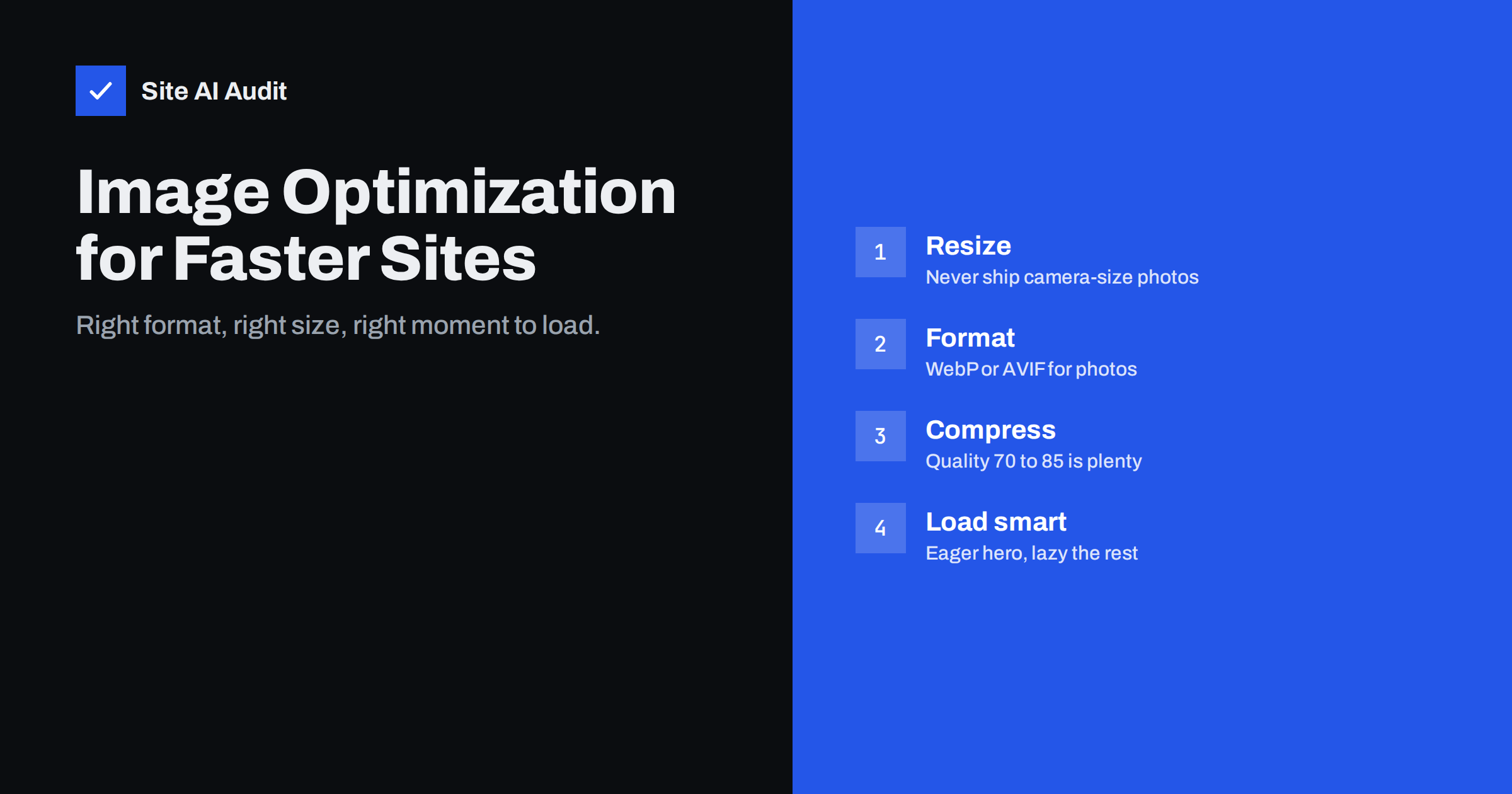
Short answer: To optimize images for a faster website, resize each image to the largest size it is actually displayed at, convert photos to WebP or AVIF, compress them at a sensible quality level, serve different sizes to different screens with srcset, set width and height to prevent layout shift, and lazy-load images below the fold while loading the main image first. These steps often cut total page weight dramatically without any visible loss of quality.
Images are what make a website look professional, and they are also what usually makes it heavy. The HTTP Archive’s long-running measurements of millions of pages consistently show images as the largest contributor to page weight on a typical web page. On small-business sites, where photos are often uploaded directly from a camera or phone, the problem is even more pronounced. The good news: image optimization is mostly mechanical, safe, and can often be automated.
Why images slow sites down
Images affect speed in several ways at once:
- Download size. A single unoptimised photo can weigh several megabytes, more than all the HTML, CSS and JavaScript on the page combined.
- Largest Contentful Paint. On many pages, the LCP element is an image. How fast it loads directly decides whether you pass Core Web Vitals.
- Layout shift. Images without dimensions push content around when they arrive.
- Mobile data and battery. Visitors on mobile networks pay for heavy pages in waiting time and sometimes data costs.
- Decoding work. Very large images take time and memory for the device to decode, even after they have downloaded.
Step 1: Resize to the real display size
The most common mistake is uploading an image far larger than it is displayed. A modern phone camera produces photos around 4,000 pixels wide. A blog content column is usually well under 1,000 CSS pixels wide, and even a full-width hero rarely needs more than about 2,000 pixels for sharp display on high-density screens.
- Check how wide each image slot is on the largest layout, and multiply by two for high-density (retina) screens as the upper limit.
- Resize before upload, or configure your CMS to scale down large uploads automatically. WordPress, for example, scales very large uploads to a maximum dimension by default and generates several smaller sizes.
- Do not rely on CSS to shrink a big image; the browser still downloads the whole file.
Step 2: Choose the right format
Different image formats are designed for different content. Using the right one is often worth more than any compression setting.
| Format | Best for | Notes |
|---|---|---|
| JPEG | Photos, as a universal fallback | Supported everywhere, larger than modern formats |
| PNG | Screenshots, graphics needing lossless quality | Very large for photos; avoid for photography |
| WebP | Photos and graphics, with transparency | Supported by all current major browsers, typically much smaller than JPEG |
| AVIF | Photos where the smallest size matters | Often smaller than WebP; slower to encode; broad modern browser support |
| SVG | Logos, icons, simple illustrations | Vector, scales perfectly, tiny when kept simple |
For most small-business sites, WebP for photos and SVG for logos and icons is a safe, well-supported default. AVIF is worth adding if your CMS or CDN can generate it automatically with a fallback.
Step 3: Compress sensibly
Lossy compression throws away detail that the eye barely notices. The right setting depends on the image, but some rules of thumb work well:
- For photos, a quality setting around 70 to 85 on typical encoder scales usually looks the same as the original at normal viewing size.
- Compare the result side by side at the size it will be displayed, not zoomed in to 400%.
- Images with text, sharp edges or flat colours tolerate lossy compression less well; check them carefully or use lossless WebP or PNG.
- Strip metadata such as camera data and GPS location. It adds weight and can leak information you did not intend to publish.
Step 4: Serve responsive images
A phone should not download the same file as a large desktop monitor. The srcset and sizes attributes let the browser pick the most suitable file:
srcsetlists several versions of the image with their widths.sizestells the browser how wide the image will be displayed at different screen widths.- The
<picture>element lets you offer AVIF or WebP with a JPEG fallback, or different crops for mobile and desktop.
WordPress adds srcset automatically for images inserted through the editor. Custom theme templates, page builders and sliders sometimes output only the full-size image, so check the HTML of your key templates.
Step 5: Load images at the right moment
Not every image needs to load immediately. Native lazy loading with loading="lazy" tells the browser to wait until the image is close to the viewport.
- Lazy-load images below the fold: gallery thumbnails, images further down articles, footer logos.
- Do not lazy-load the main image at the top of the page. It delays Largest Contentful Paint.
- Add
fetchpriority="high"to the hero or LCP image so the browser fetches it before less important files. - Use
decoding="async"on large non-critical images so decoding does not block other work.
Step 6: Prevent layout shift
Always include width and height attributes matching the image’s intrinsic aspect ratio. Browsers use them to reserve space before the file arrives, even when CSS makes the image responsive. For background images and embedded media, use the CSS aspect-ratio property on the container. This keeps Cumulative Layout Shift low and makes the page feel calmer while loading.
Step 7: Automate it
Manual optimization does not survive a busy content team. Build it into the workflow:
- CMS plugins or modules that convert uploads to WebP or AVIF and compress them automatically.
- Image CDNs that resize, convert and cache images on the fly based on the requesting device.
- Build tools for hand-coded sites, which optimise images during deployment.
- Upload rules for editors: maximum dimensions, preferred formats and no screenshots saved as huge PNGs.
After setting up automation, check a few pages: open DevTools, filter the Network panel by images and confirm that files are in the expected format and at a sensible size.
Dealing with the images you already have
New uploads are the easy part. Most established sites have hundreds or thousands of older images that were never optimised. Tackle them in order of impact rather than all at once:
- Start with templates. Logos, header images and anything that appears on every page affect every visit.
- Then your most visited pages. Your analytics tool shows which pages get the most traffic; fix the images on the top twenty first.
- Run a bulk conversion for the media library with a tool or plugin that keeps the originals as a backup, so you can roll back if something looks wrong.
- Regenerate thumbnails after changing image sizes in your theme, so the smaller versions actually exist.
- Spot-check the result on a phone and a large screen before moving on.
Common image mistakes
- Lazy-loading every image, including the hero.
- Using PNG for photographs.
- Uploading a 5 MB photo and letting CSS scale it down.
- Hero sliders with five full-width images, all loaded at once.
- Background images in CSS for important content, which the browser discovers late.
- Optimisation plugins that convert new uploads but leave years of old images untouched.
How Site AI Audit helps
Site AI Audit checks page weight and runs Google PageSpeed for mobile on your site, so oversized images and a slow main image show up in the speed findings next to LCP and CLS. It also crawls up to 50 pages on the free check and flags missing alt texts in the SEO section. Every finding comes with a plain-language fix, ranked by impact. Check your website for free to see how much your images weigh.
Related reading
- How to Improve Largest Contentful Paint (LCP) on Any Website
- How to Fix Cumulative Layout Shift (CLS) on Your Website
- Image Alt Text: How to Write It for SEO and Accessibility
The bottom line
Image optimization is the fastest speed win for most websites. Resize to the real display size, use WebP or AVIF for photos and SVG for icons, compress sensibly, serve responsive sizes, lazy-load what is below the fold and load the hero first. Then automate it, so every new upload is handled the same way.
FAQ
What is the best image format for websites?
For photos, WebP is a safe default with broad browser support and much smaller files than JPEG. AVIF can be smaller still if your tools support it with a fallback. Use SVG for logos and icons, and PNG only for graphics that need lossless quality.
What size should website images be?
Size images to the largest width they are displayed at, up to about twice that width for high-density screens. Full-width hero images rarely need to exceed around 2,000 pixels. Content images are usually much smaller.
Does compressing images reduce quality?
Lossy compression removes some detail, but at sensible quality settings the difference is not visible at normal viewing size. Compare the compressed and original versions side by side at display size. Images with text or sharp lines need more careful settings.
Should I lazy-load all images?
No. Lazy-load images below the fold, but load the main image at the top of the page immediately. Lazy-loading the hero image delays Largest Contentful Paint and makes the page feel slower.
How do I know if my images are too large?
Open your browser’s developer tools, filter the Network panel by images and sort by size. Files of several hundred kilobytes or more for ordinary content images are a warning sign. Speed tests also flag images that are larger than their displayed size.