ENEnglish
 LTLietuviškai
 DEDeutsch
 FRFrançais
 RUРусский
 ESEspañol
 PLPolski
 ITItaliano
 UKУкраїнська
 CSČeština
 PTPortuguês
 JA日本語
JA日本語 LVLatviešu valoda
 ETEesti
 HUMagyar
 IDBahasa Indonesia
 TRTürkçe
 HIहिन्दी
 ELΕλληνικά
 ARالعربية
 THไทย
THไทย VITiếng Việt
 RORomână
 MSBahasa Melayu
 BNবাংলা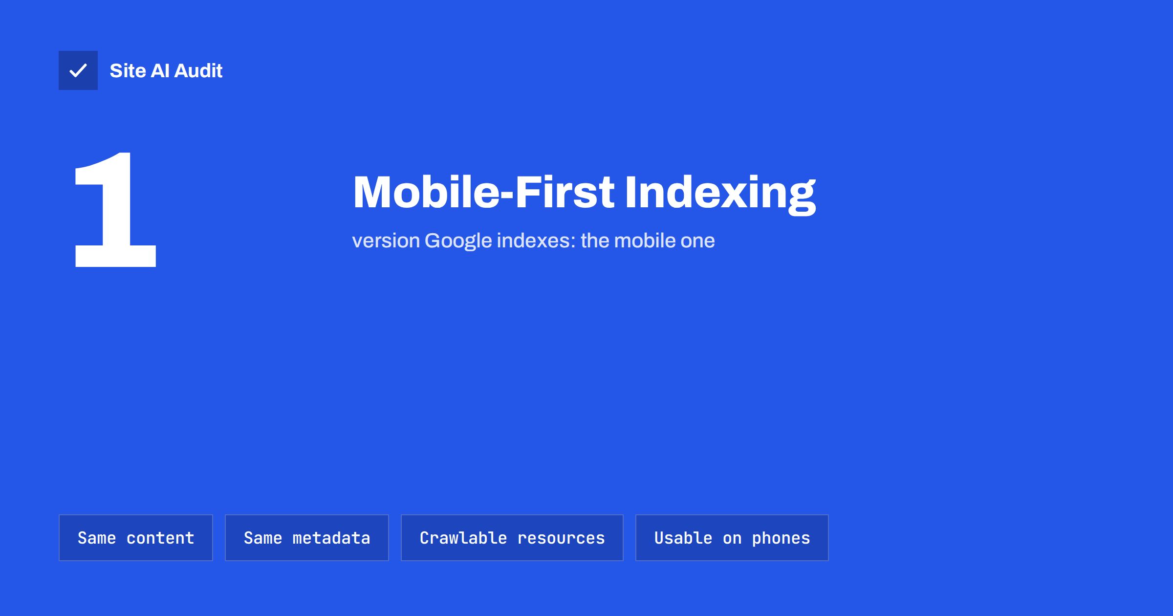
Short answer: Mobile-first indexing means Google primarily uses the mobile version of your pages, as seen by its smartphone crawler, for indexing and ranking. If something exists only on your desktop version, such as text, links, images, structured data or metadata, Google may not see it at all. The fix is simple in principle: make sure the mobile version contains the same content and signals as the desktop version, loads its resources for crawlers and is genuinely usable on a phone.
What mobile-first indexing means
For many years, Google crawled and indexed websites mainly with a desktop crawler, and treated mobile pages as alternatives. As most searches moved to phones, Google switched its approach: it now crawls and indexes pages primarily with Googlebot Smartphone. Google completed this move for practically all sites, so it is no longer something that is coming; it is how indexing works today.
The name is slightly misleading. There is no separate “mobile index”. There is one index, built mainly from what the smartphone crawler sees. Desktop users still get desktop results; they are simply based on the mobile version of your content.
Google’s mobile-first indexing best practices summarise the requirements. For most modern sites, they are already met. The problems appear on older sites, sites with a separate mobile version and sites that deliberately trim content on small screens.
Three ways sites serve mobile visitors
How much you need to worry depends on how your site handles phones:
- Responsive design. The same URL and the same HTML for every device, with CSS adjusting the layout. This is what Google recommends and what most modern themes use. Content parity is usually automatic, unless content is removed for small screens.
- Dynamic serving. The same URL, but the server sends different HTML depending on the device. Parity depends entirely on how the mobile HTML is built.
- Separate mobile URLs. A different address, such as
m.example.com, for mobile visitors. This is the most error-prone setup, with extra requirements for linking the versions and keeping content aligned.
If you run a separate mobile site or dynamic serving, moving to a responsive design removes a whole category of problems.
Content parity: the most important requirement
Because Google indexes the mobile version, anything missing there is effectively missing from your site as far as search is concerned. Common ways content goes missing on mobile:
- Removed sections. Designers hide long descriptions, FAQs, reviews or specification tables on mobile to keep pages short.
- Shorter text. A mobile template shows a summary instead of the full article or product description.
- Fewer internal links. The mobile menu, footer or sidebar contains fewer links than the desktop one, weakening discovery and internal linking.
- Missing images or alt text. Images dropped on mobile, or served without alt attributes.
- Content that loads only on interaction. Sections that appear only when a user scrolls, swipes or taps, and are not loaded in the HTML at all.
Content inside tabs, accordions or expandable sections is fine, as long as it is present in the page’s HTML. Google has said content hidden for usability on mobile, such as collapsed sections, is treated normally. What matters is that the content exists on the mobile page, not whether it is expanded by default.
Metadata and structured data parity
Beyond visible content, the mobile version must carry the same signals in its code:
- the same title tag and meta description;
- the same robots meta tags; a noindex present only on mobile pages will remove them from the index;
- the same canonical tags, correctly set for separate mobile sites;
- the same structured data, such as Product, Organization or Breadcrumb markup, with URLs updated to mobile URLs for separate mobile sites;
- the same hreflang annotations for multilingual sites;
- the same headings, so the page outline is clear.
Themes and plugins sometimes output different head elements for mobile templates, particularly on older setups. Check the source of the mobile version, not just the desktop one.
Let Google load everything
Google renders pages like a browser to see the final layout and content. For that, it needs access to the resources your mobile pages use:
- Do not block CSS, JavaScript or image folders in robots.txt.
- Make sure lazy-loaded content and images load without requiring a user interaction such as a swipe or click. Standard lazy loading that triggers when content enters the viewport is fine.
- Avoid serving the smartphone crawler an error, a consent wall that hides all content, or a different version than users see.
- Check that the server can handle the smartphone crawler’s requests without timeouts. Slow or failing responses reduce crawling.
The URL Inspection tool in Search Console shows the page as Googlebot Smartphone rendered it, including a screenshot and the rendered HTML. It is the quickest way to confirm what Google sees.
Mobile usability basics
Mobile-first indexing is about what Google indexes, but visitors on phones also need a page they can use. The basics:
- a viewport meta tag so the page scales correctly;
- text that is readable without zooming;
- buttons and links large enough to tap and spaced apart;
- no horizontal scrolling;
- no intrusive interstitials that cover the main content as soon as a visitor arrives from search;
- click-to-call phone numbers and easy forms for local businesses.
Speed is part of this experience too. Real-user speed data used by Google, such as Core Web Vitals, is measured largely on phones, where connections and processors are slower than on desktops.
Extra checks for separate mobile sites
If you still run an m. subdomain, check these carefully:
- Each desktop page has a
rel="alternate"link to its mobile equivalent, and each mobile page has a canonical pointing to the desktop page. - Mobile and desktop URLs correspond one to one; mobile users are not redirected to the mobile home page from deep links.
- Error pages match: if a desktop page exists, its mobile version must not return a 404.
- The mobile site is verified in Search Console as well.
Given the maintenance burden, planning a move to a responsive design is usually the best long-term fix.
Myths about mobile-first indexing
- “Desktop pages are no longer indexed.” They are, but Google uses the smartphone crawler to fetch them. A desktop-only site still appears in search; it just offers phone visitors a poor experience.
- “Hidden content is ignored on mobile.” Content in collapsed sections is indexed normally, as long as it is present in the HTML.
- “Mobile pages must be short.” There is no length requirement. Long, well-structured pages with clear headings work fine on phones; removing useful content to make pages shorter can cost visibility.
- “AMP is required.” It is not. A fast responsive page is enough.
- “A mobile-friendly badge guarantees rankings.” Mobile usability removes an obstacle; it does not replace relevant, useful content.
What to fix first
If you find several problems, work in this order: first anything that makes Google see less content or different directives on mobile, such as missing sections, a mobile-only noindex or missing structured data; then blocked resources that prevent proper rendering; then usability issues such as small text, crowded buttons and intrusive pop-ups; and finally speed improvements for phones. The first two affect what Google indexes at all, while the last two affect how well pages serve visitors once they arrive.
How to check your site
- Open key pages on a real phone and compare them with desktop: are all sections, links, images and FAQs present?
- View the mobile HTML source, for example with the browser’s device emulation, and compare titles, canonicals, robots tags and structured data with desktop.
- Inspect key URLs in Search Console and review the rendered screenshot and HTML.
- Check robots.txt for rules blocking CSS, JavaScript or images.
- Crawl the site with a smartphone user agent if your tool supports it.
How Site AI Audit helps
Site AI Audit checks how fast your pages feel on a phone using Google PageSpeed mobile data and Core Web Vitals, and crawls your pages for titles, headings, alt texts, links and indexing rules. Together, these findings cover the most common reasons mobile pages underperform, explained in plain words and ranked by impact. Run a free check to see how your site does on mobile.
Related reading
- Core Web Vitals Explained for Small Business Websites
- Robots.txt Explained: A Beginner’s Guide With Safe Examples
- Structured Data for Small Business Websites: A Beginner Guide
The bottom line
Google indexes the mobile version of your site. Make sure it has the same content, links, images, titles, canonicals, robots tags and structured data as the desktop version, that Google can load all resources needed to render it, and that it is easy to use on a phone. A responsive design makes this largely automatic; separate mobile sites need careful, ongoing checks.
DUK
Is there a separate mobile index?
No. There is one index, built mainly from the mobile versions of pages. Desktop searchers see results from the same index.
Does content in accordions or tabs count on mobile?
Yes, as long as it is in the page’s HTML. Content collapsed for usability on mobile is treated normally. Content that only loads after a user action may not be seen.
My site has no mobile version. Will it still be indexed?
Yes, Google indexes desktop-only pages with its smartphone crawler. But visitors on phones will have a poor experience, which affects how well the site performs overall.
How do I know what Google’s smartphone crawler sees?
Use the URL Inspection tool in Search Console and run a live test. It shows the rendered HTML and a screenshot from Googlebot Smartphone.
Should I switch from an m. subdomain to responsive design?
In most cases, yes. Responsive design uses one URL and one HTML for all devices, which removes the parity and linking problems of separate mobile sites.