ENEnglish
 LTLietuviškai
 DEDeutsch
 FRFrançais
 RUРусский
 ESEspañol
 PLPolski
 ITItaliano
 UKУкраїнська
 CSČeština
 PTPortuguês
 JA日本語
 LVLatviešu valoda
 ETEesti
 HUMagyar
 IDBahasa Indonesia
 TRTürkçe
 HIहिन्दी
 ELΕλληνικά
 ARالعربية
 THไทย
 VITiếng Việt
 RORomână
 MSBahasa Melayu
 BNবাংলা
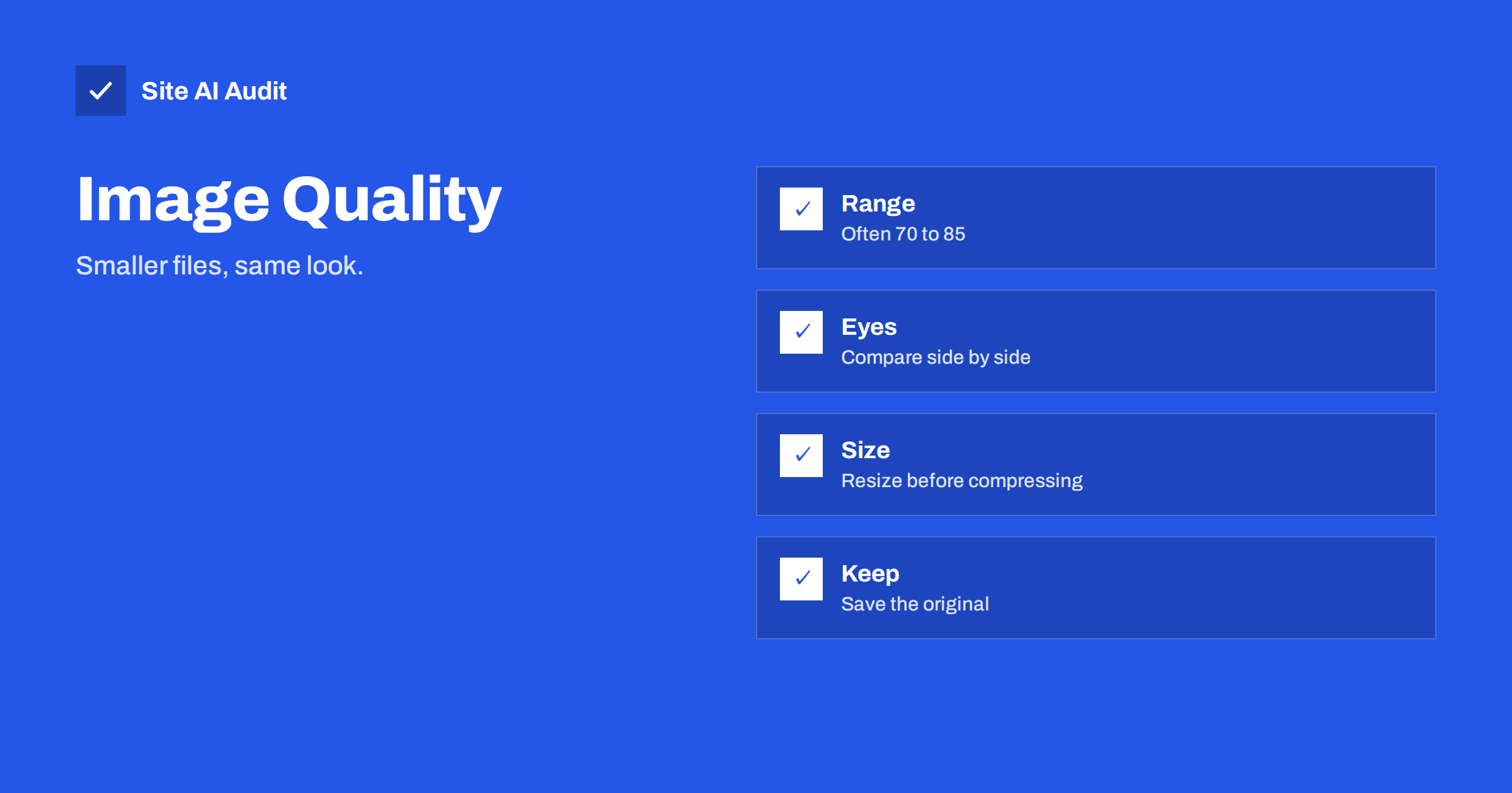
Short answer: For most photos on a website, a JPEG quality of about 75 to 85 or a WebP quality of about 70 to 80 looks almost identical to the original and cuts the file size dramatically. The right value depends on the picture, so compare a few settings by eye, resize the image to its display size first and keep the original file safe. Quality numbers are not a standard scale, so trust the result, not the number.
Why quality settings matter
Images usually make up most of the bytes a page downloads. A single unoptimised photo from a phone can weigh several megabytes, more than all the code of the page together. Lossy formats such as JPEG and WebP reduce the size by throwing away detail that the eye barely notices. A quality setting controls how much is thrown away. At a high value, the file is large and nearly perfect. At a low value, the file is small but shows blocks, blur and halos around edges.
The aim is to find the lowest value at which nobody can see a difference at the size you display the picture. Every kilobyte you save helps the page load faster on mobile, and the main image often decides the largest contentful paint, as the guide to improving largest contentful paint explains.
The quality number is not universal
A quality of 80 in one program is not the same as 80 in another. Each encoder maps the number to its own internal settings, and the difference between JPEG and WebP is also large. WebP at 75 is often similar in appearance to JPEG at 85, with a smaller file. Treat the figures in this article as starting points. The format itself matters too, and the comparison of WebP, AVIF and JPEG helps you decide which to use. This article assumes that you have chosen JPEG or WebP and want to tune it.
Practical ranges
- Hero images and large photos: JPEG 75 to 85, WebP 70 to 80. These are seen big, so artefacts show more.
- Content photos in articles: JPEG 70 to 80, WebP 65 to 75.
- Thumbnails and small previews: JPEG 60 to 75, WebP 60 to 70. Small images hide errors well.
- Product photos on a white background: choose a higher value, around 80 to 85, because smooth gradients and sharp edges show flaws easily.
- Screenshots, logos and text: avoid lossy compression where you can. Use PNG, SVG or lossless WebP, since text turns fuzzy under JPEG.
Going below about 60 rarely pays off. The file shrinks less and less, while the visible damage grows quickly.
Resize first, then compress
The biggest saving does not come from the quality slider. It comes from the size in pixels. A photo of 4000 by 3000 pixels shown in a column 800 pixels wide carries about twenty-five times more pixels than the screen can use. Resize the image to the largest size at which it will be displayed, allowing for sharp screens, which may need twice the pixels. Then apply compression. Offering several sizes and letting the browser choose is covered in the article on responsive images with srcset, and in WordPress the generated sizes are described in image sizes and thumbnails.
The general guide to image optimisation shows where this step sits in the whole routine.
How to compare quality by eye
- Export three versions of the same image, for example at 90, 80 and 70.
- View them at 100 percent on a normal screen, and then at the size they will have on the page.
- Look at the hard areas: smooth skies, skin, edges of text on objects, fine patterns and dark gradients, where blocks and banding appear first.
- Pick the lowest version in which you cannot see a difference without zooming.
- Note the setting and apply it to similar images as a default.
Free tools make this easy. Browser-based tools let you drag a comparison slider between the original and the compressed version and show the file size next to each. Command-line tools and image editors can batch-process a folder once you have found the right value.
Different kinds of picture behave differently. A photo of a landscape with grass, leaves and clouds hides compression well, because the natural texture masks small errors. A portrait with smooth skin, a product against a plain background or a sky with a gentle gradient shows problems sooner, as blocks and bands appear in areas that should be smooth. That is why one global setting is a compromise. If your site has both kinds of image, use a higher value for the smooth ones, or test a few examples of each kind before you choose a default for the whole library.
Screen density matters as well. On a phone with a sharp display the picture is viewed from a short distance, but its pixels are small, so compression artefacts are harder to see than on a large monitor. This is one reason why a moderate quality combined with a larger pixel size often looks better than a high quality at a small pixel size. If you must choose between the two, keep the pixels and lower the quality a little.
Other settings that save bytes
- Remove metadata. Camera data, location and thumbnails inside the file can add tens of kilobytes. Strip them unless you need them, and note that location data can also be a privacy risk.
- Use progressive JPEG. The image appears first in rough form and then sharpens, which feels faster on slow connections, and files are often slightly smaller.
- Chroma subsampling. Most encoders store colour at lower resolution than brightness. This is invisible in photos and saves a lot, but it can blur red text or thin coloured lines, where you should turn it off.
- Avoid repeated saving. Every time a lossy file is edited and saved again, quality drops. Always start from the original and export once.
Automate it, but keep the original
Doing this by hand for hundreds of images is slow. A plugin or an image service can compress on upload and deliver modern formats to browsers that support them, as the article on image CDNs describes. Choose a sensible default, such as 80, and check a sample of results after setting it up, because automatic compression is not equally good for every image. Always keep the uncompressed originals in a separate place. Later you may need a different size, a new format or a crop, and you cannot restore lost detail from a compressed copy.
Also check the image delivered to a mobile device, not only the one on your desktop. Lazy loading helps with the images below the first screen, as the guide to lazy loading explains, but the main image above the fold should be loaded at once and be as light as possible.
Be careful with images that carry meaning in fine detail, such as a chart, a map, a floor plan or a photo of a product label. Visitors may zoom in to read them, and a heavy compression turns small text into mush. Use a higher quality or a lossless format for these, and accept the larger file, ideally loaded only when the visitor opens it. A useful rule is to ask what the visitor needs to see in the picture. If the answer is the general impression, compress boldly. If the answer is a detail, protect the detail.
A worked example
A bakery’s home page has a hero photo of 3200 by 2000 pixels at JPEG quality 95. It weighs 1.8 MB. The page shows it in a container 1200 pixels wide. The owner resizes it to 2400 pixels, which keeps it sharp on high-density screens, and exports at quality 80. The file drops to about 300 KB. Exporting as WebP at 75 brings it to around 200 KB, and nobody, including the owner, can tell the difference when looking at the page. The change removes about 1.6 MB from the first view, which on a typical mobile connection saves seconds. The same method on twelve product photos saves several megabytes across the shop. The numbers will vary with each picture, which is why the comparison step matters.
Check your page weight
An audit shows which images are too large and how much the page weighs on mobile. Run a free check with Site AI Audit and look at the speed findings.
Related reading
- Image Optimization for Faster Websites: A Practical Guide
- WebP vs AVIF vs JPEG: Which Image Format Should You Use?
- Lazy Loading Images: When It Helps and When It Hurts
- Page Weight: How Heavy Is Too Heavy and How to Trim It
The bottom line
Resize to the displayed size, then compress to the lowest quality that still looks the same, usually around 75 to 85 for JPEG and 70 to 80 for WebP. Compare by eye, strip needless metadata and keep the originals for later.
FAQ
What JPEG quality is best for websites?
Between 75 and 85 suits most photos. Hero images lean to the higher end and thumbnails to the lower end.
Is WebP always smaller than JPEG?
Usually, at a similar look, but not always. Compare real files, since the result depends on the image and the encoder.
Why does my compressed image look blurry?
The quality may be too low, or the image may be scaled up by the page. Check the display size and the source size.
Should I use lossless compression?
For logos, screenshots and graphics with text, yes. For photos, lossless files are large and rarely needed on a web page.
Does image quality affect SEO?
Indirectly. Lighter images make pages faster, which supports page experience, while blurry images may hurt engagement and image search appeal.