ENEnglish
 LTLietuviškai
 DEDeutsch
 FRFrançais
 RUРусский
 ESEspañol
 PLPolski
 ITItaliano
 UKУкраїнська
 CSČeština
 PTPortuguês
 JA日本語
JA日本語 LVLatviešu valoda
 ETEesti
 HUMagyar
 IDBahasa Indonesia
 TRTürkçe
 HIहिन्दी
 ELΕλληνικά
 ARالعربية
 THไทย
THไทย VITiếng Việt
 RORomână
 MSBahasa Melayu
 BNবাংলা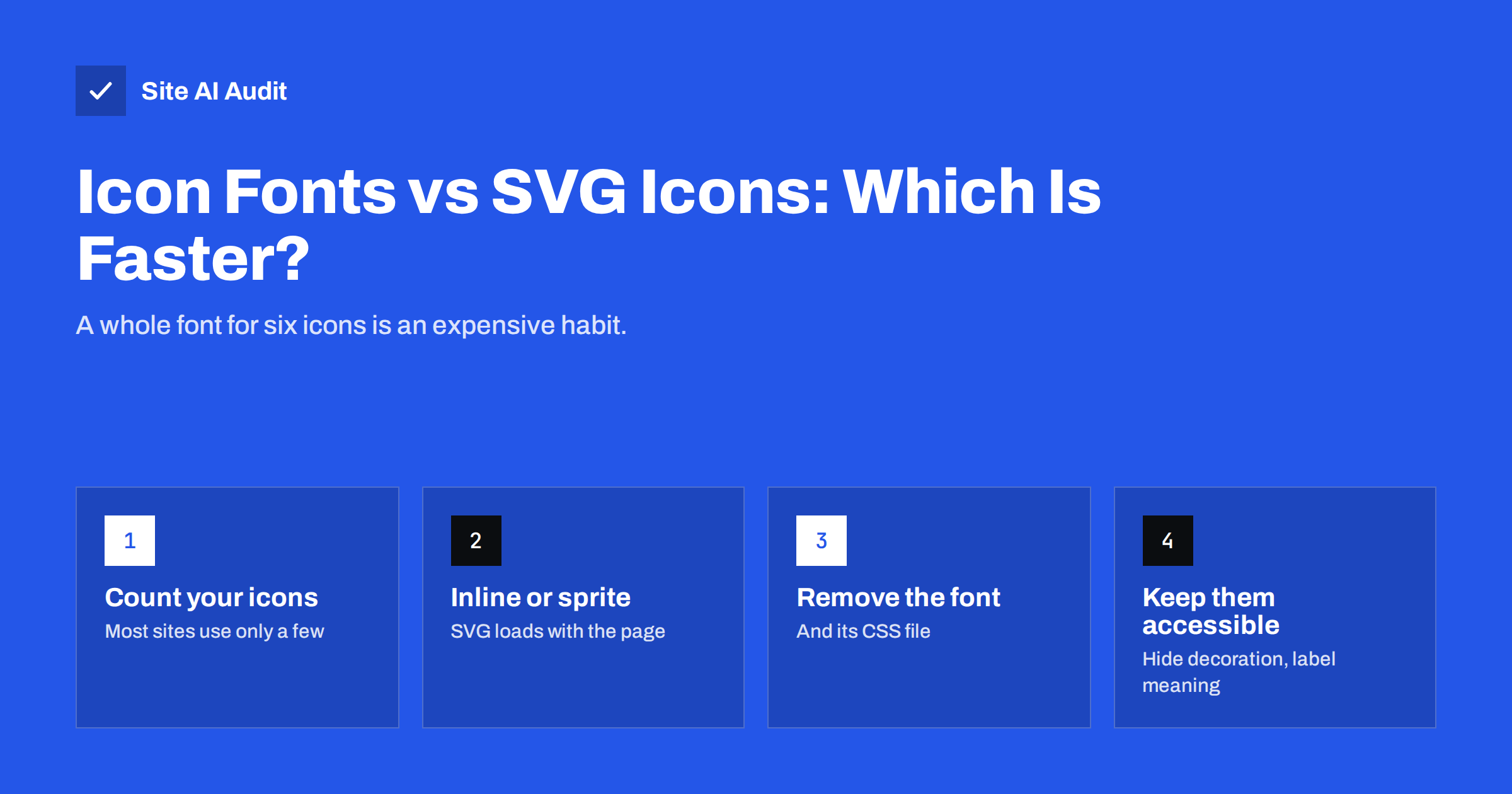
Short answer: For most websites, SVG icons are faster and more reliable than icon fonts. An icon font such as a full Font Awesome kit loads a CSS file and one or more font files containing hundreds of icons, even if the page shows six, and icons can appear late, as empty boxes or as words while the font loads. SVG icons can be placed directly in the HTML or in a small cached sprite, render immediately, scale sharply and are easier to make accessible. If you cannot switch yet, subset the icon font to the icons you use.
How icon fonts work, and why they became popular
An icon font is a normal web font where the characters are pictures instead of letters. A CSS class such as fa-phone inserts a special character, and the font draws it as a phone icon. Around a decade ago this was a clever solution: icons scaled cleanly on high-resolution screens, could be coloured with CSS and came as a single download instead of dozens of small images.
Many themes, page builders and plugins still include icon fonts by default, which is why so many small-business websites load them today, often more than one set at once. Browser support for SVG has long been universal, though, and SVG now does everything icon fonts did, with fewer drawbacks.
The performance cost of icon fonts
The main problem is that you load far more than you use:
- Whole library for a few icons. A complete icon font contains hundreds or thousands of glyphs. Depending on the set and format, the files commonly weigh tens to several hundred kilobytes, plus a CSS file with a rule for every icon. A typical site uses a phone, an envelope, a few social logos, a menu icon and some arrows.
- Extra requests and render-blocking CSS. The icon CSS is usually a stylesheet in the page head, which the browser must download before it renders anything. Our guide on render-blocking resources explains why that delays the first paint.
- Late icons. Fonts are downloaded only after the browser finds out they are needed. Until then, icons are invisible, shown as empty squares, or, with ligature-based sets, shown as words such as “menu” or “search”.
- Layout shifts. When the font arrives and icons change size, text next to them can move, which adds to Cumulative Layout Shift. See how to fix CLS.
- Duplicates. It is common for a theme, a page builder and a plugin to each load their own copy of the same icon library, sometimes in different versions.
Icon fonts compete for bandwidth with your real content fonts too. Our guide to web font performance covers why every font file should earn its place.
Why SVG icons are usually better
SVG is an image format made of shapes described in text. A simple icon is often only a few hundred bytes. Its advantages:
- Load only what you use. Each icon is included on its own, so six icons cost six icons, not a library.
- No waiting for a font. Inline SVG is part of the HTML and appears as soon as the surrounding content renders.
- Sharp at any size. Like fonts, SVG scales without blur on any screen.
- Easy to style. Using
fill="currentColor"makes an icon take the text colour, just as an icon font did, and CSS can change size, colour and even individual parts. - More reliable. SVG is not affected by font blocking, user font settings or ad blockers that sometimes block font domains.
- Better accessibility. You control exactly what assistive technology hears, instead of relying on private-use characters that screen readers may announce oddly.
The table below compares the three common approaches side by side.
| Icon font | Inline SVG | SVG sprite | |
|---|---|---|---|
| What loads | CSS plus font file with the full set | Only icons on the page, inside the HTML | One file with the icons you chose |
| Extra requests | Usually two or more | None | One, cacheable |
| Appears | After the font loads | With the HTML | After the sprite loads, usually quickly |
| Styling | Colour and size | Full control | Colour and size, some parts |
| Best for | Legacy sites | A few icons per page | Many icons reused across pages |
Three ways to use SVG icons
- Inline SVG. Paste the
<svg>code directly into the HTML or template. Ideal when a page uses a handful of icons, such as a header and footer. The downside is that the markup is repeated on every page and is not cached separately, which is fine for small icons. - SVG sprite. Put all your icons in one SVG file as
<symbol>elements, and reference each one with the SVG use element. The file is downloaded once and cached, which suits sites with many icons repeated across pages. - SVG as an image. Use
<img src="icon.svg" alt="...">. Simple and cacheable, but the icon cannot inherit the text colour, so it suits logos and illustrations more than interface icons.
In most small-business sites, inline SVG for the few interface icons plus <img> for logos is the simplest and fastest combination.
How to switch from an icon font to SVG
- List the icons you actually use. Search your templates and content for the icon classes, such as
fa-oricon-. Most sites end up with ten to thirty. - Get the SVG versions. Major icon libraries, including Font Awesome, publish their icons as individual SVG files, so the design stays the same. Check that your licence covers the use.
- Optimise the SVG files. Remove editor metadata and unnecessary attributes with an SVG optimiser; simple icons often shrink noticeably.
- Replace the markup. Swap each icon element for inline SVG or a sprite reference, and set
fill="currentColor"and a width and height so the layout does not shift. - Remove the icon font. Dequeue or delete the icon CSS and font files. Check the page source and network panel to confirm they no longer load.
- Test visually. Compare key pages before and after on desktop and mobile, and run a speed test to confirm the improvement.
WordPress and page builders
On WordPress, icon fonts are usually loaded by the theme, a page builder or plugins such as sliders and social sharing tools. Our article on page builders and performance covers their overall cost. Practical steps:
- Look for a setting to disable icon libraries you do not use; many themes and builders have one, sometimes called “load Font Awesome” or “inline SVG icons”.
- Some page builders offer an option to render their icons as inline SVG instead of a font. Turning it on removes the font download.
- If a plugin loads its own copy of an icon library, check whether you still need that plugin, or whether its icons can be disabled.
- After changes, clear all caches and check the network panel for any remaining icon font files.
If you must keep the icon font for now
Sometimes a redesign is not possible yet. You can still reduce the cost:
- Subset the font to the icons you use, with an icon font builder or subsetting tool. This can shrink the file dramatically.
- Serve WOFF2 only to modern browsers, and self-host the files instead of loading them from a third-party domain.
- Preload the icon font if icons appear in the header, so it starts downloading early.
- Remove duplicate libraries so only one icon set loads.
- Reserve space for icons with fixed width and height to limit layout shifts.
Together these reduce the page weight described in our guide on trimming page weight, though they do not remove the extra requests.
Accessibility: do not lose meaning when switching
Decorative icons next to text, such as a phone icon before a phone number, should be hidden from assistive technology with aria-hidden="true" on the SVG. Icons that stand alone and carry meaning, such as a search button with only a magnifying glass, need an accessible name, for example an aria-label on the button or a visually hidden text label. Make sure interactive icons have a large enough tap area on mobile.
How Site AI Audit helps
Site AI Audit runs Google PageSpeed for your pages on mobile as part of every audit and reports the speed findings, Core Web Vitals, compression and page weight, each explained in plain words and ranked by impact. Heavy fonts, render-blocking CSS and layout shifts caused by late icons show up in those results, so you can see whether icons are worth fixing on your site. You can run a free check and compare the results after switching.
Related reading
- Image Optimization for Faster Websites: A Practical Guide
- Critical CSS Explained: What It Is and Whether You Need It
- Minifying CSS and JavaScript: What It Really Saves You
The bottom line
Icon fonts load a whole library, add render-blocking requests and can show icons late or shift the layout. SVG icons load only what you use, appear with the page, scale sharply and are easier to make accessible. Switch to inline SVG or a sprite where you can, remove the old font completely, and if you cannot switch yet, subset and self-host the font.
FAQ
Are icon fonts bad for performance?
They often are, because they load a full set of icons and a CSS file for a few icons on the page. They can also delay icons and cause layout shifts while the font loads.
Is SVG faster than Font Awesome?
Using the Font Awesome icons as individual SVGs is usually faster than loading the whole Font Awesome icon font, because only the icons you use are included.
Should I use inline SVG or an SVG sprite?
Inline SVG is simplest for a few icons per page. A sprite suits sites with many icons reused across pages, because the file is downloaded once and cached.
How do I make SVG icons accessible?
Hide decorative icons with aria-hidden=”true”. Give meaningful icons, such as icon-only buttons, an accessible name with aria-label or hidden text.
Can I reduce the size of my icon font without switching?
Yes. Subset it to the icons you use, serve WOFF2, self-host it, remove duplicate libraries and preload it if icons appear at the top of the page.