ENEnglish
 LTLietuviškai
 DEDeutsch
 FRFrançais
 RUРусский
 ESEspañol
 PLPolski
 ITItaliano
 UKУкраїнська
 CSČeština
 PTPortuguês
 JA日本語
JA日本語 LVLatviešu valoda
 ETEesti
 HUMagyar
 IDBahasa Indonesia
 TRTürkçe
 HIहिन्दी
 ELΕλληνικά
 ARالعربية
 THไทย
THไทย VITiếng Việt
 RORomână
 MSBahasa Melayu
 BNবাংলা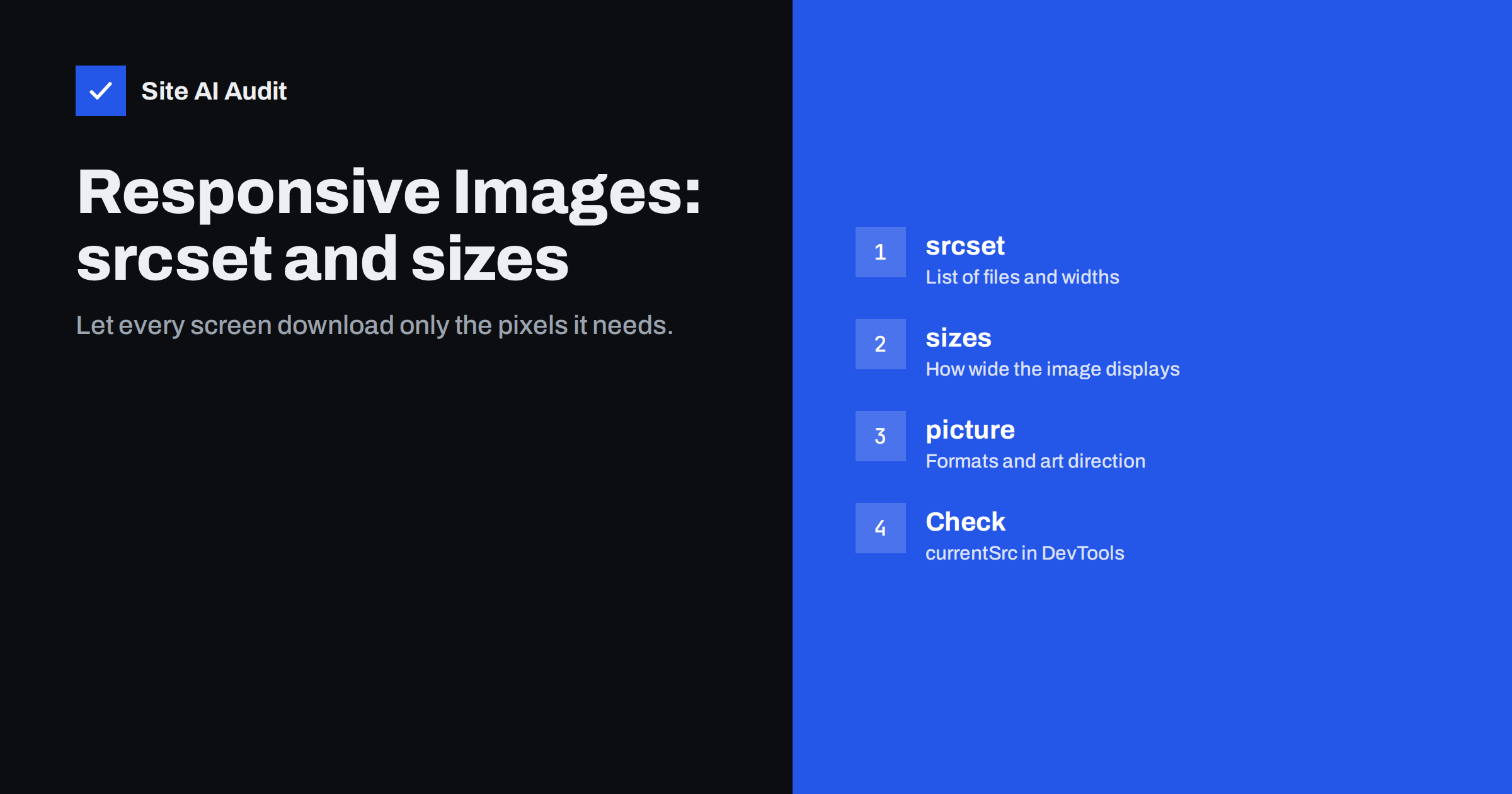
Short answer: Responsive images let the browser choose the most suitable image file for each device. The srcset attribute lists several versions of the same image with their pixel widths, and the sizes attribute tells the browser how wide the image will be displayed at different screen widths. The browser combines this with the screen’s pixel density and picks the smallest file that still looks sharp. Use the <picture> element when you need different formats or different crops. Done correctly, phones download much smaller files than large desktop screens.
A phone with a small screen and a desktop monitor that is several times wider should not download the same image. Yet on many websites they do, because the page references a single large file. That wastes bandwidth on mobile, slows Largest Contentful Paint and costs visitors data. Responsive image markup has been supported by all major browsers for years, and content management systems like WordPress generate much of it automatically. Understanding how it works helps you spot when your theme or page builder gets it wrong.
The problem responsive images solve
Consider a full-width hero image. On a large desktop monitor it may be displayed around 1,900 CSS pixels wide, and on a high-density display the browser could use twice as many physical pixels. On a typical phone it is displayed at roughly 360 to 430 CSS pixels wide, perhaps at two or three times density. A single 2,400-pixel file looks good everywhere, but the phone downloads several times more data than it needs.
Responsive images let you provide, for example, 480, 800, 1,200, 1,600 and 2,400 pixel versions and let each browser choose. The phone might pick the 800 or 1,200 pixel version, the desktop the 2,400 pixel version.
srcset with width descriptors
The most common pattern uses width descriptors (w), which tell the browser the actual pixel width of each file:
<img src="hero-1200.webp" srcset="hero-480.webp 480w, hero-800.webp 800w, hero-1200.webp 1200w, hero-1600.webp 1600w, hero-2400.webp 2400w" sizes="100vw" width="2400" height="1260" alt="...">
srcis the fallback for very old browsers and a sensible default.- Each
srcsetentry is a file URL followed by its intrinsic width. sizesdescribes the displayed width; here, the full viewport width.widthandheightgive the aspect ratio so the browser can reserve space.
The browser calculates the needed width (displayed width times device pixel ratio) and picks a suitable candidate. It may also consider network conditions or files already in the cache, which is allowed by the specification.
Writing the sizes attribute
The sizes attribute is where most mistakes happen. The browser needs it because it chooses the image before CSS layout is complete, so it cannot yet know how wide the image will be. If sizes is missing, the browser assumes the image is as wide as the viewport (100vw), which leads to oversized downloads for images in columns or sidebars.
sizes is a list of media conditions and widths, evaluated in order, with a final default:
sizes="(min-width: 1200px) 760px, (min-width: 768px) 60vw, 100vw"
This says: on screens at least 1,200 pixels wide, the image is displayed 760 pixels wide; on screens at least 768 pixels wide, it takes 60% of the viewport; otherwise, the full viewport width. Match these values to your actual layout. They do not need to be exact; being approximately right is enough to avoid large overdownloads.
A newer option, sizes="auto", lets the browser use the actual layout size for lazy-loaded images, because layout is known by the time they load. Browser support is growing, and WordPress adds it for lazy-loaded images in recent versions, with a fallback value for browsers that do not support it.
srcset with density descriptors
For images displayed at a fixed size, such as a logo or an avatar, you can use density descriptors (x) instead:
<img src="logo-200.png" srcset="logo-200.png 1x, logo-400.png 2x" width="200" height="60" alt="...">
The browser picks the version matching the screen’s pixel density. No sizes is needed. For logos and icons, SVG is often better still, because one file stays sharp at every density.
The picture element: formats and art direction
The <picture> element wraps an <img> and adds <source> elements for two purposes:
- Format selection: offer AVIF, then WebP, with the
<img>as JPEG fallback. Each source has atypeattribute, and the browser uses the first one it supports. - Art direction: offer a different crop for small screens, for example a tighter portrait crop of a wide landscape hero, using
mediaattributes on the sources.
Each <source> can have its own srcset and sizes. The <img> inside still carries the alt text, dimensions and loading attributes.
How WordPress handles responsive images
WordPress generates several sizes for each uploaded image and adds srcset and sizes automatically for images inserted through the editor. That covers most content images. Problems arise when:
- a theme or page builder outputs images with a hard-coded full-size URL and no
srcset; - background images are set in CSS, which cannot use
srcset(useimage-set()in CSS or switch to an<img>); - the
sizesvalue does not match the layout, for example claiming 100vw for an image in a narrow column; - the registered image sizes do not include a size close to what the theme actually displays;
- thumbnails were not regenerated after changing theme or image size settings.
How to check what the browser chooses
- Open the page in Chrome with DevTools and select the image in the Elements panel.
- Hover over the
srcor check the Properties tab forcurrentSrc, which shows the file actually used. - Use device emulation to switch between phone and desktop widths and reload; the chosen file should change.
- In the Network panel, filter by images and compare the downloaded dimensions with the displayed size.
- Run PageSpeed Insights; the “properly size images” or “improve image delivery” audit lists images that are larger than needed.
Note that browsers keep a larger image once cached; reloading after shrinking the window may still show the large file. Test in a fresh window at each size.
How many sizes should you generate?
More sizes give the browser finer choices but mean more files to create and store. For most sites, four to six widths per image are plenty. A practical set for full-width images might run from around 480 pixels up to around 2,400 pixels in steps where each version is roughly 30 to 50 percent larger than the previous one. For images in content columns, the largest version only needs to be about twice the column’s maximum width. There is little benefit in generating a 3,000-pixel version of a thumbnail that is never displayed wider than 300 pixels. If you use an image CDN, it can generate sizes on demand from a single original, which removes the storage concern and lets you describe widths freely in srcset.
Common mistakes
| Mistake | Effect | Fix |
|---|---|---|
| No sizes attribute on column images | Browser assumes full width, downloads too large | Add sizes matching the layout |
| Only one large file in srcset | No choice for small screens | Provide several widths |
| Wrong width descriptors | Browser picks unsuitable files | Descriptors must match actual file widths |
| Missing width and height | Layout shift | Always include dimensions |
| Lazy-loading the responsive hero | Slower LCP | Load hero eagerly with high priority |
| CSS background for key images | No responsive selection, late discovery | Use img or image-set() |
How Site AI Audit helps
Site AI Audit measures page weight and runs Google PageSpeed for mobile, which flags images larger than their displayed size and shows their effect on LCP. The free check crawls up to 50 pages, so you can see whether oversized images are a site-wide template issue or limited to a few pages. Each finding comes with a plain-language fix. Run a free check.
Related reading
- Image Optimization for Faster Websites: A Practical Guide
- WebP vs AVIF vs JPEG: Which Image Format Should You Use?
- Lazy Loading Images: When It Helps and When It Hurts
- Why Your Website Is Slow on Mobile and How to Fix It
The bottom line
Responsive images let each device download only the pixels it needs. Provide several widths in srcset, describe the displayed width accurately in sizes, use <picture> for modern formats and different crops, and keep width, height and loading attributes correct. Then check currentSrc on real screen sizes to confirm the browser picks what you expect.
FAQ
What is the difference between srcset and sizes?
Srcset lists the available image files and their widths. Sizes tells the browser how wide the image will be displayed. The browser uses both, plus the screen’s pixel density, to choose a file.
Do I need the sizes attribute?
Yes, when you use width descriptors and the image is not displayed at full viewport width. Without it, the browser assumes the image spans the whole viewport and often downloads a file that is too large.
Does WordPress add srcset automatically?
Yes, for images inserted through the editor, based on the image sizes it generates on upload. Theme templates, page builders and CSS background images may not use it, so check their output.
When should I use the picture element?
Use it to offer modern formats like AVIF or WebP with a fallback, or to show a different crop on small screens. For simple resolution switching of one image, img with srcset and sizes is enough.
How do I know which image the browser downloaded?
Select the image in Chrome DevTools and check its currentSrc property, or look at the image requests in the Network panel. Test in a fresh window for each screen size, because cached larger versions may be reused.